VISUAL IDENTITY
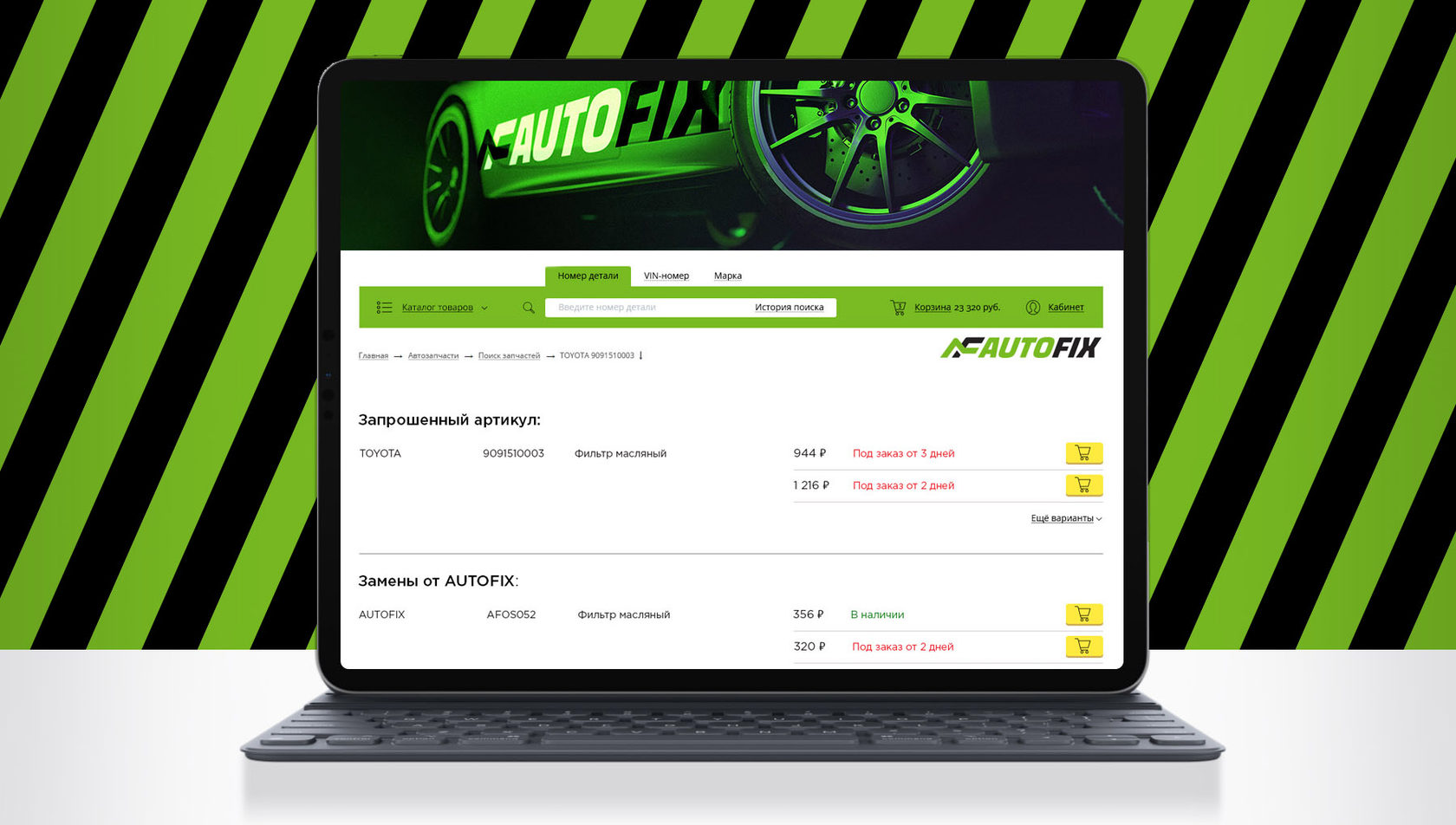
Objective: to develop a visual identity for AUTOFIX auto parts store.
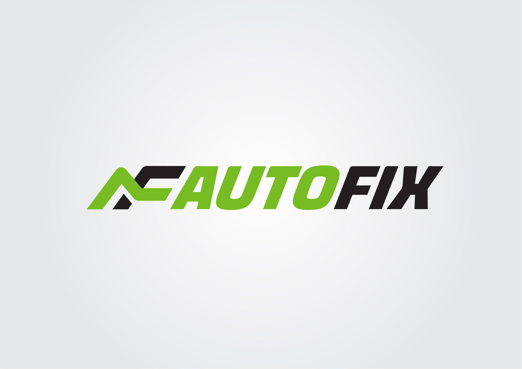
The developed character is based on the readable letters "A" and "F". The text spelling of the name is dynamic due to the tilt of the characters to the left and the readable arrow in the space between the letters "I" and "X".
The developed character is based on the readable letters "A" and "F". The text spelling of the name is dynamic due to the tilt of the characters to the left and the readable arrow in the space between the letters "I" and "X".

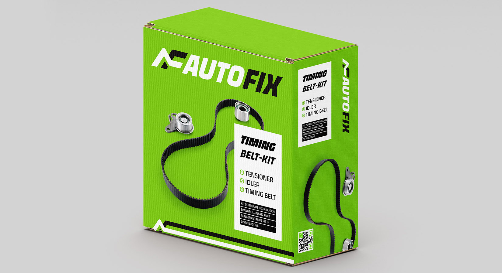
AUTOFIX. SPARE PARTS PACKAGING

VISUAL IDENTIFICATION


Contacts
If your product or service needs a brand or have questions, contact us.
+7 904 323-23-87
sibindesign@gmail.com
sibindesign@gmail.com