Vernum
Auto
Auto
INTEGRATED BRAND LAUNCH
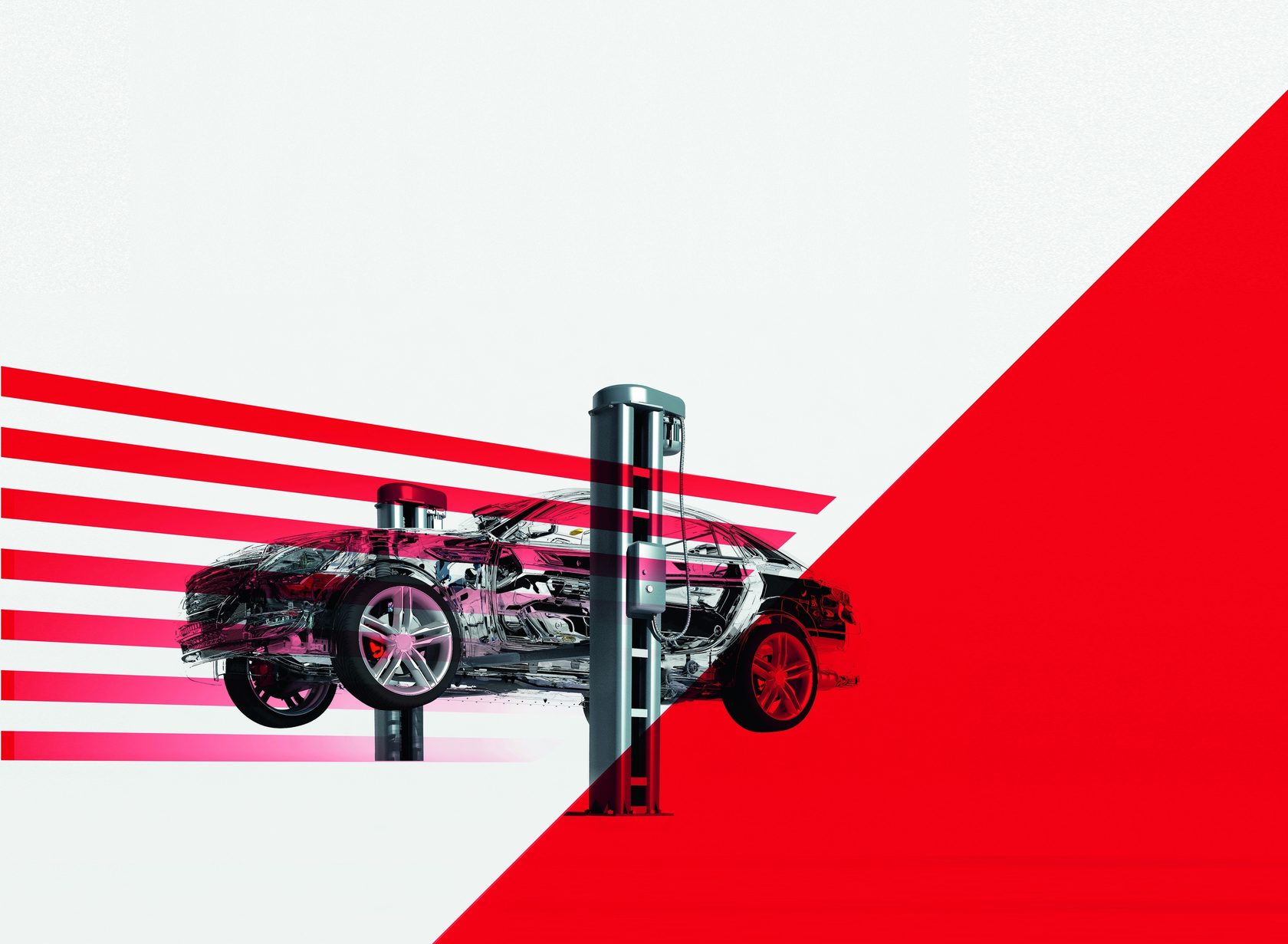
The logo is based on the following associative series: the letters V and A, zebra as a safe transition from problems with the machine to its solution, the diagonal is a positive trend. The logo is modern, open and minimalistic. Dynamic diagonal elements can be used in the development of communication media, documentation and souvenirs, as well as in the design of internal and external spaces of technical centers.
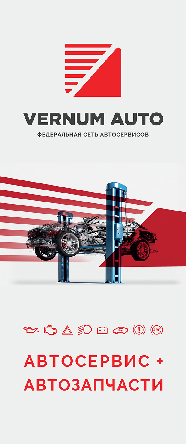
For the new federal car service network VERNUM AUTO, a visual brand identification system was developed that includes the basic elements - logo, color and layout templates. Based on the basic elements, the necessary business documentation was developed: letterhead for letters and offers, business cards, envelopes, a folder for proposals, a background for presentations; communication media: navigation elements, flags, badges, posters, modules in the media, billboards, information leaflets, exhibition and information stands, car design; souvenir products, as well as standards for the design of facades and interiors.
For the new federal car service network VERNUM AUTO, a visual brand identification system was developed that includes the basic elements - logo, color and layout templates. Based on the basic elements, the necessary business documentation was developed: letterhead for letters and offers, business cards, envelopes, a folder for proposals, a background for presentations; communication media: navigation elements, flags, badges, posters, modules in the media, billboards, information leaflets, exhibition and information stands, car design; souvenir products, as well as standards for the design of facades and interiors.
VERNUM AUTO.
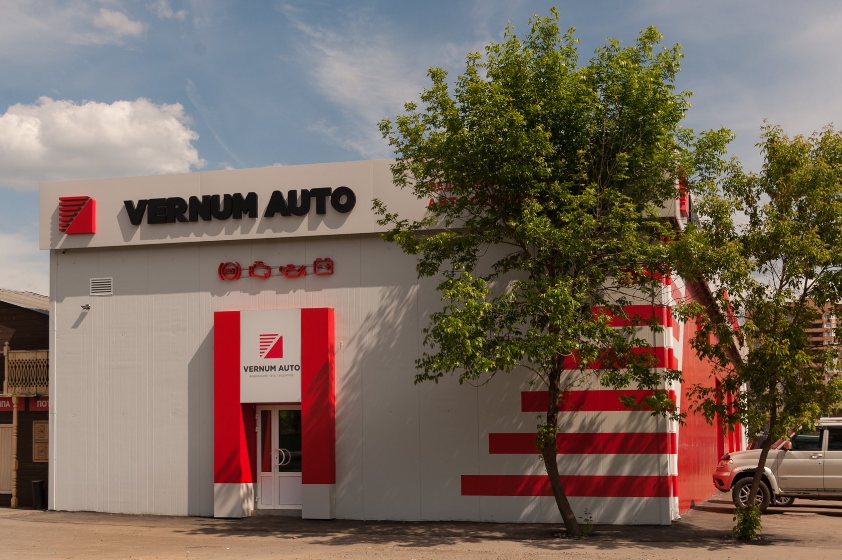
FACADE DESIGN
FACADE DESIGN
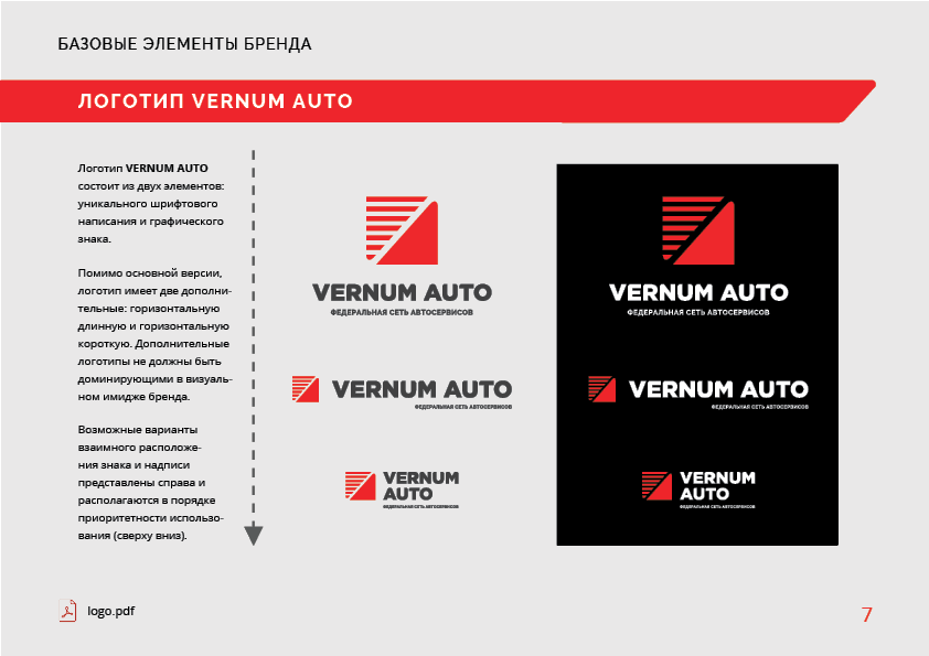
For high-quality and correct use of identity elements, a guide was developed containing rules and standards for the work of company employees, designers and printers. The manual includes all ready-made images and layouts in vector format.
PAGE FROM THE GUIDELINES FOR THE USE OF VISUAL IDENTIFICATION OF THE BRAND
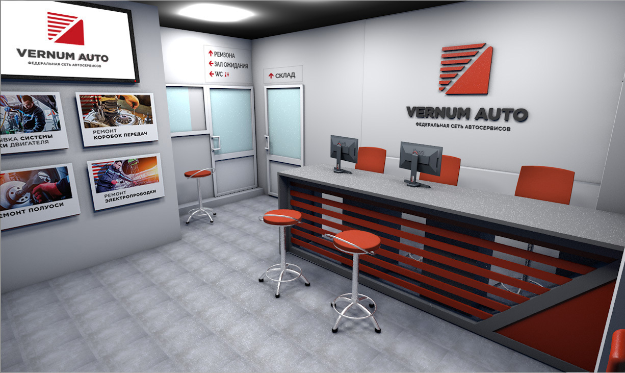
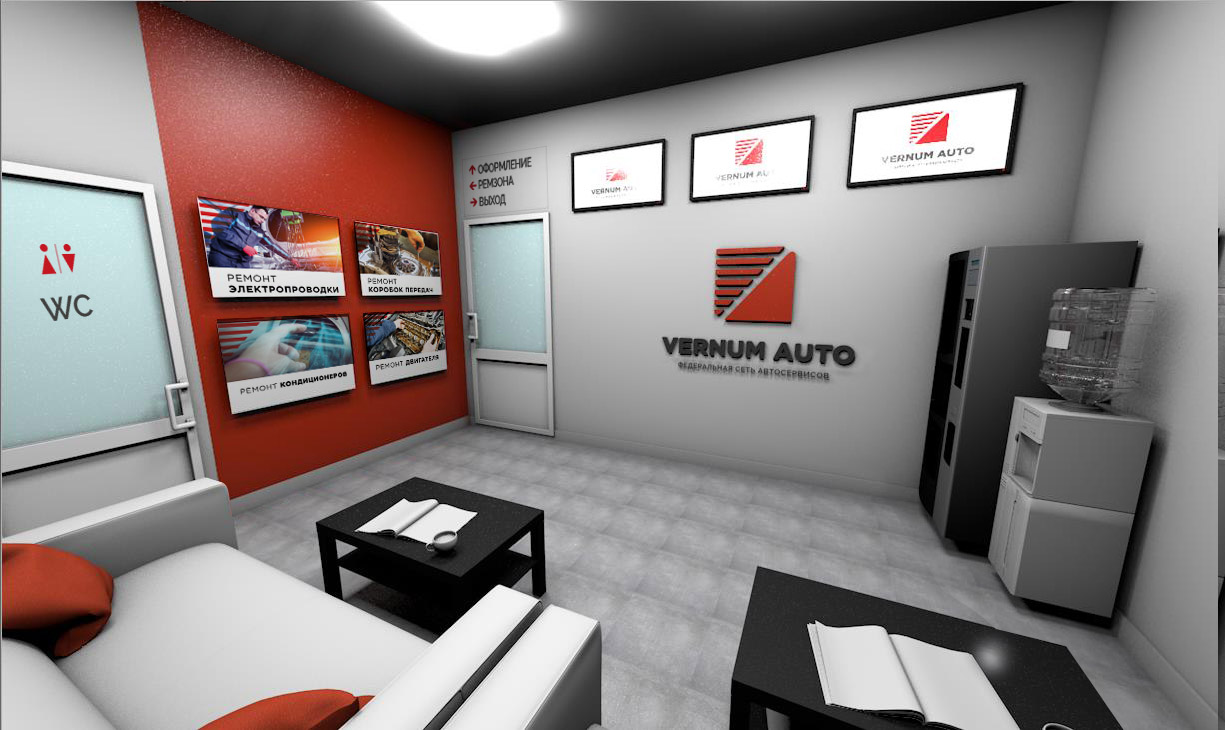
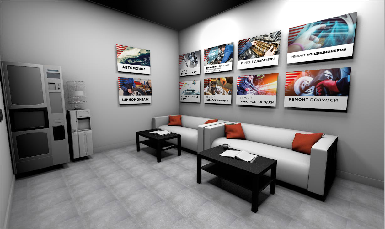
INTERIOR DESIGN OF
RECEPTIONS AND WAITING ROOMS
RECEPTIONS AND WAITING ROOMS
Contacts
If your product or service needs a brand or you have questions, contact us.
+7 904 323-23-87
sibindesign@gmail.com
sibindesign@gmail.com